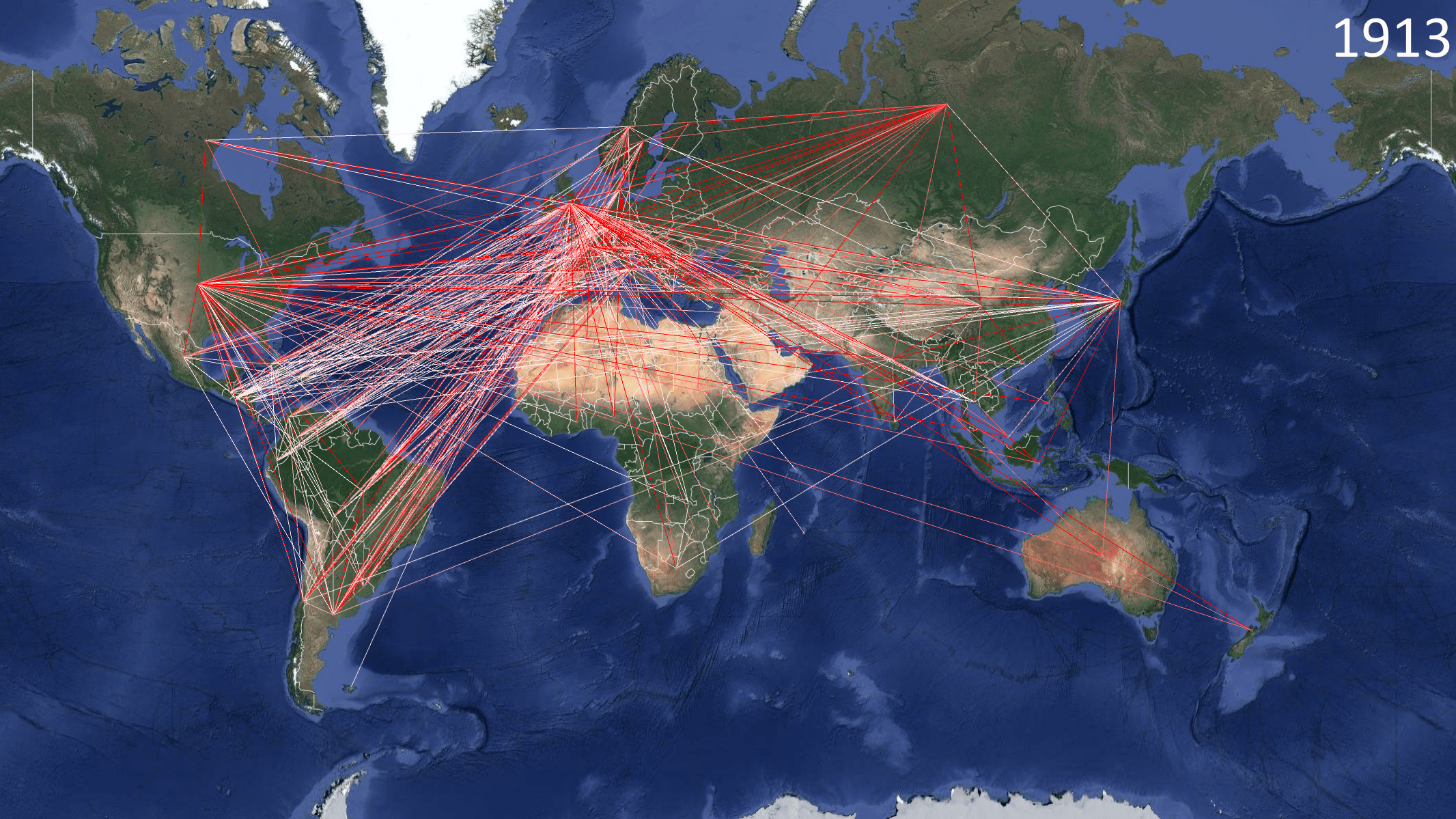
The movie below is a visualization of the development over time of the world dyadic (between countries) trade network. A line between (the centers of) two countries represents a recorded merchandise trade flow between them that year. The redder the line the relatively larger the flow. Trade is measured in millions of US dollars. The set of lines defines the trade network for that year.
99 countries, 616 trade dyads, and 32,270 recorded trade flows are represented in this 130-year timespan.
There are three different movie sizes to choose from:
Small (960 x 640 pixels)
An alternative way to view the small movie is below. (9.5 MB) (return by clicking the back arrow)
Growth of the World Trade Network-960×640
Medium (720p or 1280 x 720 pixels) (15.4 MB) (return by clicking the back arrow)
Growth of the World Trade Network-720p
Large (1080p or 1920 x 1280 pixels) (36 MB) (return by clicking the back arrow)
Growth of the World Trade Network-1080p
An image depicting the trade network in 1913 is below. The redder the line the relatively larger the trade flow:

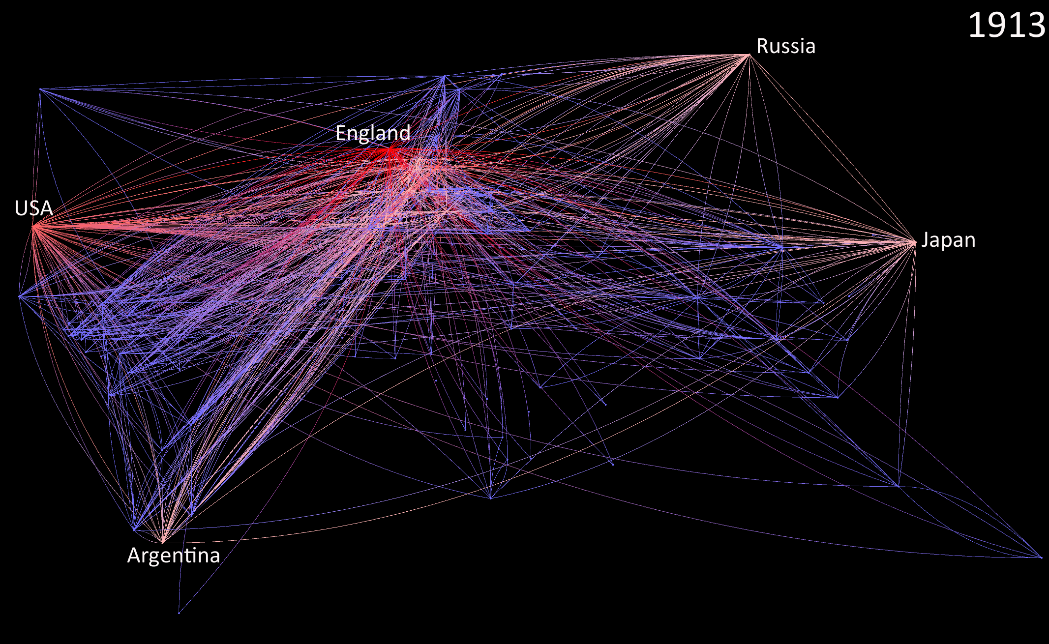
An image depicting the degree measure–the number of connections possessed by a country–of that same trade network in 1913 is below. Red signals a country with high degree (lots of trade partners) while blue signals low degree and intermediate levels of degree are displayed in pink. This map can also be thought of as a depiction of core-periphery relations in the world economy.

If you wish to see earlier versions of the animation, please click here.
If you wish to download the datafiles created to make this animation, please click here.

